January was the first month of the sketchbook circle. The first challenge was to choose the right sketchbook – the only constraint was that it must fit through a letterbox. The next, and more challenging, was to have an idea and make some art to go in the sketchbook – something interesting to another artist!
On a visit to Tate Modern I found the perfect sketchbook – landscape, A5, spiral bound and containing what seemed to be the right amount and right quality of paper.
 On that visit to Tate Modern I accidentally visited the Mira Schendel exhibition – getting the ticket along with one for the Paul Klee exhibition I had gone to see. As soon as I set foot in the gallery and saw Mira Schendel’s work I knew it would be this that I used as inspiration for the art in the sketchbook. I did some drawing on in the galleries and continued when I got home.
Mira Schendel (1918 – 1988) was born in Zurich, but lived and worked in Latin America. There’s more information about her life on a time line here Tate Modern Mira Schendel timeline
 I was struck by her use of marks, text and numbers as part of her work. I liked the way she drew onto different surfaces, many of which were transparent or translucent, and then hung the drawings in sets encouraging the viewer to look from both sides. The way the light shone through was significant, as was the way the panels overlapped.
Another set of drawings I liked very much were a set of seventeen tall, thin panels displayed along one wall showing a landscape that continued from one piece to the next. She made this set in 1978 using tempera on paper.
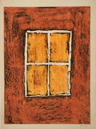
 The other set of work that caught my eye was a wall of small abstract drawings, each using shape and colour. There were four sets of four – sixteen different drawings. She made these as designs for greeting cards in the 1960s using oil stick and gouache on paper. The sets were unified by size, shape and orientation as well as colour. The positions of various coloured shapes and outlines in one or two colours on a plain coloured background made the entire wall very striking – I like sets of images displayed together.
I drew extensively and took notes in my sketchpad. Some of the drawings can be seen in Drawing a Day blog post for 11th January 2014.
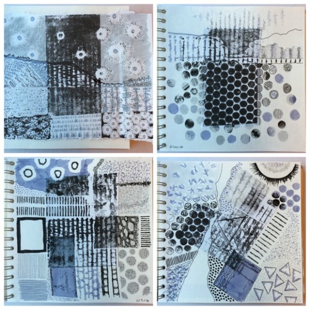
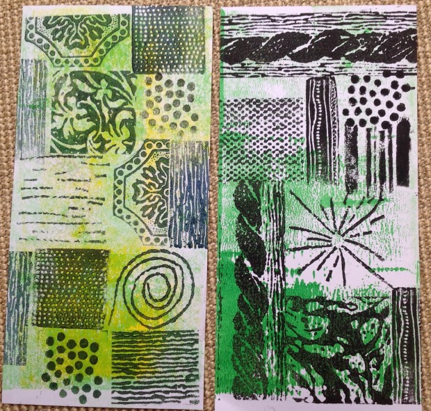
 During the next few weeks I experimented with mark making on transparent and translucent surfaces and overlapping these. I made some small panels of cellophane, tissue paper, was paper and tracing paper and use black pen and black ink.
These are the separate panels I made.

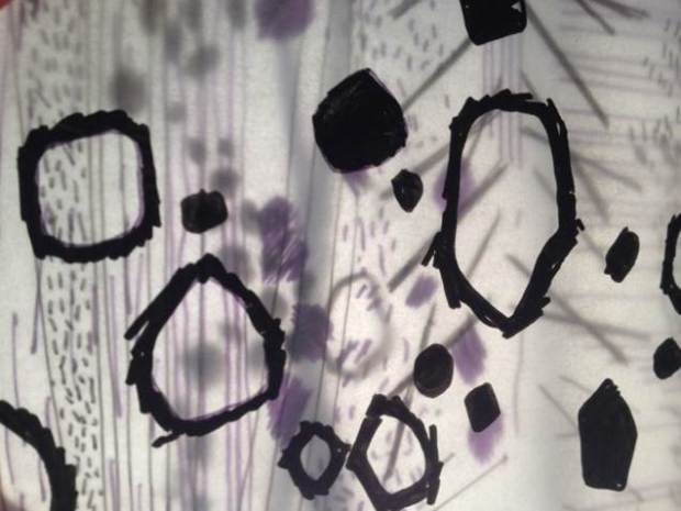
I then overlapped the panels in different combinations and photographed against natural light and a lamp, exploring the differences moving the layers around made.

Although the panels are small – about 10 x 10 cm I liked the effects I could create by changing their position and the kind of light used to shine through.
Later I made marks and lines to ones more reminiscent of trees and leaves onto a zig zag of different surfaces.
 I folded this and photographed to explore the views through the trucks, branches and foliage – this is something I have long sought to explore through drawing and printmaking.
 All of these panels and experiments were stuck into the sketchbook, with notes and links to a Pinterest board of images of Mira Schendel’s work.
At the end of January I used this experience along with others to give a presentation at the Wellingborough #TeachMeet exploring how social media could support drawing in schools. I later wrote this up as a post on the The Big Draw blog.
I also sent my sketchbook to Mary and waited to receive a sketchbook from Karen.
In February I used the idea of overlapping surfaces with some colleagues at a Northampton Inspire network meeting for teachers. We made surfaces and photographed them but went a step further by manipulating the images digitally using various apps. More about it here on the Northampton Inspire site.
 Since then I’ve been looking around for interesting papers to use all over the place. For the papers in the packs that were sent out I found the music manuscripts and old book pages from Avenue books; the Chinese pages from abandoned text books in the book exchange at work and the insides of envelopes from ongoing recycling since I began to see art teachers using these in last year’s sketchbooks.